Explore the latest trends and find our updates on all you need to know about what is happening in the world of web and technology.

VueJS is a progressive JavaScript framework used for building user interfaces (UIs) and single-page applications (SPAs) on the web. It was created by Evan You in 2014, and has since become one of the most popular frontend frameworks alongside React and Angular. VueJS is known for its simplicity, flexibility, and ease of use, making it a popular choice for developers of all skill levels.
VueJS is based on the Model-View-ViewModel (MVVM) architecture pattern. The framework uses a virtual DOM (Document Object Model) to render UI components, which means that it only updates the parts of the page that have changed instead of reloading the entire page. VueJS also allows for the creation of reusable components, making it easier and faster to build complex web applications.
VueJS uses a template-based syntax that is similar to HTML, making it easy for developers to understand and use. The framework also supports two-way data binding, which means that any changes made to the UI are automatically reflected in the data model, and vice versa. This makes it easier to build dynamic and interactive web applications.
There are several advantages to using VueJS for frontend development. One of the biggest advantages is its simplicity and ease of use. VueJS has a smaller learning curve compared to other frontend frameworks, making it a popular choice for developers of all skill levels. It also has a smaller file size, which means that it loads faster and takes up less space on the user's device.
Another advantage of VueJS is its flexibility. The framework can be integrated into existing projects or used to build new ones from scratch. VueJS also supports server-side rendering, which means that pages can be rendered on the server before being sent to the client, improving performance and reducing load times.
VueJS also has a vibrant and active community of developers, which means that there are tons of resources, plugins, and tools available to make development faster and easier.
While there are many advantages to using VueJS, there are also some disadvantages to consider. One disadvantage is that VueJS is not as widely used as other frontend frameworks like React and Angular. This means that there may be fewer job opportunities for developers who specialize in VueJS.
Another disadvantage of VueJS is that it may not be suitable for large and complex web applications. While VueJS is flexible and easy to use, it may not have the same level of scalability and performance as other frontend frameworks.
VueJS is often compared to other popular frontend frameworks like React and Angular. While each framework has its own strengths and weaknesses, VueJS is known for its simplicity and ease of use, while React is known for its performance and scalability, and Angular is known for its comprehensive set of features and tools.

VueJS is a good choice for developers who are looking for a simple and flexible frontend framework that is easy to learn and use. It is also a good choice for developers who are working on smaller and less complex web applications. However, if you are working on a large and complex web application, you may want to consider using a more comprehensive frontend framework like React or Angular.
VueJS can be used for a wide range of web applications, from simple landing pages to complex single-page applications. Some common use cases for VueJS include:
Getting started with VueJS is easy. First, you need to install Node.js, which is a JavaScript runtime that allows you to run JavaScript on the server. You can download Node.js from the official website.
Next, you need to install Vue CLI, which is a command-line interface tool for VueJS. Vue CLI makes it easy to set up and manage VueJS projects. You can install Vue CLI using the following command:
npm install -g @vue/cli
Once Vue CLI is installed, you can create a new VueJS project using the following command:
vue create my-project
This will create a new VueJS project in a directory called "my-project". You can then navigate to the directory and run the following command to start the development server:
cd my-project npm run serve
VueJS has a vibrant and active ecosystem of tools and resources that make development faster and easier. Some popular tools and resources for VueJS include:
VueJS has been used to build a wide range of web applications, from simple landing pages to complex single-page applications. Here are some examples of applications built with VueJS:
VueJS is a simple and flexible frontend framework that is easy to learn and use. It is a good choice for developers who are working on smaller and less complex web applications. However, if you are working on a large and complex web application, you may want to consider using a more comprehensive frontend framework like React or Angular.
If you are interested in learning more about VueJS, there are plenty of resources and tools available to help you get started. Whether you are a beginner or an experienced developer, VueJS is a great choice for building fast and responsive web applications.


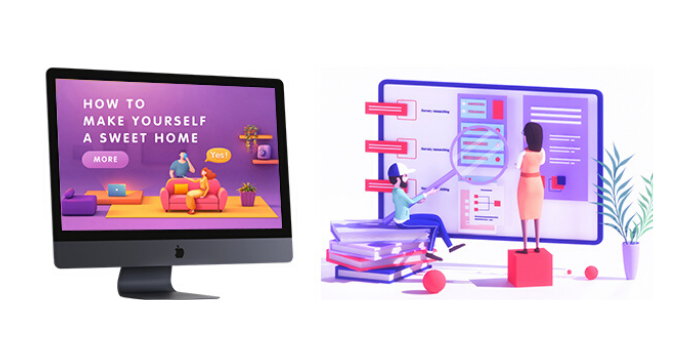
Are you planning to create a web application project? If so, you should consider working with a professional web design company. Working with a web design company can provide you with many advantages, such as access to experts in the field and a more polished end product. In this article, we'll take a look at the benefits of working with a professional web design company, what to look for when choosing one, and tips for working with them.
Creating a web application project is a big undertaking and requires a lot of expertise. It's important to work with a professional web design company that understands your project's needs and can create a product that reflects your vision. Working with a web design company can provide you with access to experienced developers, designers, and other professionals who can help you create a successful web application. It can also save you time, as the web design company can handle the entire process from start to finish.
A web design company is a business that specializes in creating websites and web applications. They employ experienced professionals who have the skills and expertise necessary to design, develop, and test web applications. They are knowledgeable in the latest technologies and can help you create a web application that meets your needs. They can also provide ongoing support and maintenance for your web application, ensuring that it runs smoothly and is secure.
When it comes to creating a web application, there are many features and benefits of working with a professional web design company. Here are some of the most important ones:
There are many different types of web design companies, each with their own set of services and offerings. Here are some of the most common types of web design companies:
When it comes to finding the best web design company for your project, there are a few things to consider. Here are some tips for finding the best web design company for your project:
When choosing a web design company, it's important to look for certain qualities that will ensure you get the best service possible. Here are some things to look for when choosing a web design company:
When interviewing web design companies, it's important to ask the right questions to make sure you find the best company for your project. Here are some questions to ask when interviewing web design companies:
Working with a professional web design company can provide many benefits. Here are some of the benefits of working with a web design company:
Working with a professional web design company can provide many advantages, such as access to experts in the field and a more polished end product. It can also save you time, as the web design company can handle the entire process from start to finish. When choosing a web design company, make sure to research their reputation, ask questions, and look for certain qualities. It's also important to communicate and be involved in the process to ensure that your application meets your expectations. By following these tips and taking advantage of the benefits of working with a professional web design company, you can create a successful web application project.

Imagine having the opportunity to reach out to every customer to make sure that they understand to appreciate the product personally while exposing themselves to potential customers looking for a product. Unfortunately, that is not something you can do at once, and that is why your company website does it for you. A reliable website is one of your greatest assets, and a touchpoint to make or break.
Various age groups have different demands. Diversity is one of the major things that make the web amazing. Henceforth, the focus needs to be put on understanding and appreciating the difference that age can make in building a digital forum. It can be a challenge to build UX according to the various age groups, but the consequent production and use of the interface change traditional software behavior.
An article by Impact analyzing UX's market interest notes that 61 percent of users move to another site if they are unable to locate what they are searching for instantly. While bad UX can cost them customers and money from their businesses, good UX can bring them in. A well-planned website that is easy to use and has excellent content can make a potential customer a regular one.
The way you conduct UX decides whether your website will perform or not. You already know that consumers differ demographically and psychologically. Still, they also vary generationally - meaning that, if not well planned, your website or app design might unintentionally drive away your customer base.
When it comes to design, different generations need, expect, and are comfortable with different things. Websites, therefore, rarely follow a single size fits all formula despite common misunderstanding. While you may want to reach every consumer, priority should be given to your primary consumer. You can then integrate factors that appeal to this customer category into your website design.
Many age groups have different needs than digital platforms, as we have seen. And how do those generational differences turn into designing for the UX? It has been described that making the interface user friendly depends on a few factors: Fonts, color and contrast, gestures, expression, and navigation, and flow or UI chart of the user. Below are some of the metrics that benefit from this work when developing UX for different generations:
Young kids want the show. The main goal is to keep them busy. The direct target is not necessary for the mind. So UXD for infants allows us the opportunity to involve them through experimentation and interaction.
Teenagers rely on keeping up with technology. Technology is the most prevalent among adults than among young people. From here, their introduction to the world from friends, family, and acquaintances begins. Interaction with children has been significant, whereas young adults only like interactivity when it serves a function and promotes their current mission.
They are the digital natives, the people who accompanied technology before the critical mass technologies were taken over. The now Millenials have been or are involved in testing usability, psychological analysis, and ergonomics. Those are the people who alter business winds.
Elderly consumers appear to be overlooked, but they are the ones who understand the importance of user interaction and brand, product, or consumer experience. Between 35 and 55, these adults took technology on board and appreciated the importance of good user experience. It requires among them:
The current user group to embrace the digital world is seniors aged 56-80. The seniors are there to learn and cultivate the Smartphone and tablet habits as their regime. This age group of users over 60 years of age appears to be the simplest but is the hardest to understand. There are numerous user experience design aspects to take care of while designing a' senior-friendly' digital platform.
We see different generations of people on digital platforms having various dependencies and having certain expectations, needs, and demands. In today's rapidly evolving technological landscape, where smartphones, tablets, PCs, and wearables have become an inseparable part of human life, serving users with the best user experience is paramount. In a quick view see the UX design for different user generations;
Although every generation has expectations for what makes a good UX, there are a few common UX concepts that apply across the board to consumers. Each page is designed like a landing page. Creating every page of your website with the same attention to detail that you offer to your homepage guarantees a positive experience when customers visit your site.
Easy to navigate, transparent layouts, and user experience will decide how your client feels about your brand, whether or not you are meeting their needs, and whether your company's product is appealing to potential clients. Use UX concepts such as those discussed above will help you customize your digital experience. It will boost the image of your brand to your client, and eventually, help your company benefit.

The dark themes have been the most sought after features in app design for some years now. Last year macOS launched Dark Mode, and Google declared a broad universal range of Dark Theme. While it was once rare, the current patterns are now dark themes and have become popular.
If done correctly, design the dark mode for your Mobile App is easier to read in low light. They lower the eyestrain. Based on the screen, they facilitate low battery consumption. Nevertheless, a beautiful dark theme is not easy to create. We will look at how mobile app designers can start providing their users with a dark mode UI design experience.
If used for long, the apps that feature too much brightness are harmful to our eyes. The use of dark mode will help relax the eye-opening, making it easier to work on applications. It helps solve these persistent problems of health and well-being, thus answering why dark mode is common.
Any trend-oriented mobile app design company would tell you that it needs to be designed according to match the recent market demands. Dark UI is the most popular design element on demand since the last year.
Dark mode app design helps to lengthen the battery life of the device. Google confirmed that a dark mode on OLED screens is a game-changer for the device's battery life. YouTube saves up to 15 percent more battery life in dark mode than the flat background at its 50 percent brightness.
When reading a white text on a black background, the iris opens more and becomes more luminous, and the deformation of the lens develops a fuzzier focus on the eyes. This is called the Halation Effect, one of the biggest challenges in the design of dark mode devices. Due to the high contrast, unhealthy dark mode tends to be very harsh on the eyes and can strain them very fast.
If every pixel gives out its sense of illumination to display darkness in OLED, the pixel does not light up at all. But because most OLED panels are limited to a refresh rate of 60Hz, scrolling lets the pixels light up, and the slow refresh rate induces a jiggly effect.
Google comes with robust support for documentation that lets designers understand how the dark theme functions on the Android ecosystems. The tech companies have established four principles that define dark UI design and provide a starting point for how dark mode can be designed.
Use grey color instead of solid black when designing a dark theme to show space and elevation in a wide depth range environment.
In dark theme UIs, add minimal color accents, so the majority of space is devoted to dark surfaces.
Conserve the battery life by using light pixels when designing the dark mode in items that need performance (such as devices with OLED screens).
Accommodate regular users of dark themes (such as those with low vision), by meeting the color contrast standards for accessibility. The Google Guidelines for Dark Color Scheme and Overall Mode set different properties.
Elevation: The modules maintain the same default shadow modules and elevation levels as for the light theme throughout the process of developing the dark theme.
The higher the elevation of a surface, the lighter the surface would be. The application sees the lightness of a semi-transparent overlay.
Accessibility and contrast: The backdrop should be dark enough to display white text in dark theme UI design. They will use a minimum contrast of 15.8:1 between the text and the context. Doing so ensures that when applied to surfaces at the highest elevation, the body text meets the WCAG AA norm of 4.5:5:1.
Colors: The dark theme UI should avoid saturated colors; instead, designers should concentrate on using desaturated colors because they increase readability. The choice of primary and secondary colors should also rely on both the light and dark UI themes being considered.
Light text on dark areas: When a light text appears on a dark backdrop, specific opacity rates must be used:
States: States use the overlays to communicate the status of interactive elements for the dark theme templates or components. In a dark theme, states must use the same values for overlay as the default light theme. Two containers inherit the overlays of the State: Surface and Secondary.
Surface containers that use the surface color have to add an overlay that suits the text or icon color. The state overlay must be white for the surface containers which use the primary color.
Apple has revisited the sense of UI style and colors inside iOS with dark mode. Let us look at the updates Apple has introduced to help you develop dark mode on iOS 13.
Apple has come up with colors for the commonly applied UI elements to standardize the look and feel of the iOS apps in both dark and light mode. These colors do not have an absolute RGB value, and they adapt directly to the iOS interface style.
Apple has also developed 9 predefined system colors and the semantic colors, which are dynamic and support the dark system-wide appearance. This means that such colors are appropriate for selected design types, such as semantic colors.
Apple has introduced 4 blur effects and 8 vibrancy effects with iOS 13, which automatically adapts to the design of the iOS app. Apple has also implemented 4 vibrancy effects in the typography suite for dark iOS mode, 3 in the overlay, and 1 for the separator.
Apple provides a set of more than 1500 symbols. Human Interface Guidelines for Software developers and designers to use in their applications. They look great in the Dark Mode since they have been designed for both light and dark UI.
Dark themes have a lot of advantages, and these days are prevalent. Nevertheless, they are challenging to enforce fully. The simple way to invert shades and reuse colors would improve eyestrain, do reading in low light more delicate and split the data and visual hierarchy. Below is a quick summary of how to design dark mode for your mobile app effectively.
10.png)
In this article, we will be discussing what web design trends are going on nowadays. We will throw some light on the top 5 web design trends that will be changing the look & appearance of web applications in many ways in the coming time.
After looking at different kinds of websites & mobile apps, we can easily come to know that current web design trends are an absolute mixture of the visual side of graphic design and the high-tech side of evolving technology. It can be seen that the technical possibilities seem endless and designers play with extremes, reinvent previous styles, and ceaselessly experiment with new techniques. Some popular styles such as the ever-present minimalism and colorful flat 3D illustrations will not go away anywhere as we've been seeing this for some time now. Let's discuss the top 5 web design trends now:-

People always delight with 3D visuals, this trend had lost its existence but what held this trend back was technology. The technology is now in a place where you can design in 3D through different available software in the market. Interactive 3D graphics & illustrations encourage users to stay longer on your website. In 2020 and in the future, we expect to see more immersive 3D web designs breaking down the boundaries between digital space and reality. Not only for UI perspective, but this is also an advantage for UX as well.

We often see that one of the main trends of the coming time will be dark design, mainly focusing on giving users an option to enable dark themes. Dark mode web designs not only look ultra-modern & eye-catching, but it makes easy to pop colors and design elements.
Actually, dark themes are better for OLED screens saving power and extending screen lifespans. But this utility doesn't stop them from looking good. Dark backgrounds improve the visibility of other accent colors as well. Hence, this trend has been growing its power for some time. We are definitely going to see more & more dark background designs in the future.

Typography in design is another strong aspect of UI/UX that holds users to stay on your web page since this is the design element that delivers the actual purpose of the website. A design should honor the message that the product's creators want to deliver to their users. Bold typography helps designers to achieve that. Oversized fonts serve a functional purpose they make it easy to read the text. Look at the following examples that convey how powerful a bold & oversized font can be:

The neuromorphic design actually pretends to extrude from the background, it's a raised shape made from the exact same material as the background. This effect is achieved by playing with two shadows, one at negative values while the other at positive. But for it to work, our background cannot be fully dark or fully light. It needs at least a tiny bit of tint so both dark and light shadows will be visible. These kinds of designs are now playing a vital role in the User Interface. Web designers also think that this trend will get stronger & more effective in 2020 & ahead.

Another best website design inspiration we are seeing is the micro rotating animation trend. These types of animations leave users curious for more because they feel interacting with the screen or interface directly.
Therefore, micro & effective animations are extremely helpful when it comes to guiding users through their interactions with your website. Not only eCommerce companies but other small & medium enterprises are also using micro animations to enhance the user experience and give their customers a taste of what their products are like.
While these web design trends are surely changing the look & style of User Interfaces. The UI designer's job is playing with the shapes, so every time the shape turns out a bit different or new it's bringing a bit of that joy back. This is the constant exploration of designers that make all products look quite different from one another. But this is also to be kept in mind that each new trend comes with caveats and has to be carefully designed to be usable.
Thanks to this multitude of different design trends, movements, and styles it's safe to say that web design in 2020 & coming future will be full of surprises.

Ruby on Rails and Django are both the best frameworks for web development, but how do you choose one over the other. The aspects they share vary from programming language similarities where both Ruby and Rails are object-oriented and dynamically typed, as well as their specific performance for each task.
In the programming environment, there are different Web Development Frameworks available to programmers, but the commonly used are Django and Ruby on Rails. They emerge as popular web frameworks, and this popularity has been expected to continue until 2020.
If you are trying to choose between the two, both Django and Rails are great choices there are a few things to consider that will help you make the right choice.
It is absolutely okay to say Ruby on Rails and Django are like twins, differentiating them only occurs between the language used under the hood and the philosophies used- each of this framework is born in a different environment.
Ruby and Python have nearly the same level of performance. The differences are not significant for a standard CRUD device. The difference is just as small in wider applications- but if consistency is high on your priority list and you need to serve thousands of users at the same time, then neither is the right choice.
Let's put it this way, both are fantastic for expensive CPU operations such as image manipulation and can support thousands of users but configuring Ruby and Python for this size requires much more effort.
As mentioned above, Python and Ruby are object-oriented and dynamically typed languages- they differ greatly from the languages used in companies in architectures such as Java.
One big difference is that Python and Ruby are open-source and their respective communities are very active and robust. It means you won't struggle to find answers or information if you stick to using these tools.
The architecture of both languages is well-structured based on an MVC template- the app will be properly organized and will have simple divisions between layers such as specified routes, controllers, models and bounded views within the framework. Items are arranged a little differently in Rails and Django, but it's just the format so there's nothing to consider.
Django is a Python-based web framework and a primary way to create Python applications. What makes it so popular is that it is a free, general-purpose, open-source program that makes it easy to use. Developers highly appreciate the functionality of Django. It has developed to simplify the process of creating complex websites that are powered by databases. This system has a simple and functional model.
Ruby on Rails, written under the MIT License, acronynized as RoR is an open-source web application platform on the server-side. As a model-view-controller, Rails offers incredible default servers, web services, and page structures. Developers are known to write code as a timesaving process.
The system works based on two principles, namely DRY (Don't Repeat Yourself) and Setup Convention. The latter being self-explaining removes the need to repeatedly perform the same programming function, while the latter means that by definition the world you operate in, such as structures, databases, languages and more, allows for many logical scenarios.
When the user interface grounds compare Django vs Rails, both are the winners. It is because both of them are designed to offer an experience of high quality. Such web-centered frameworks enable the Mobile App Development Company to create highly functional websites packed with perfect add-ons and plugins.
While the Django web platform inherited the scalability of Python, it still lags a bit behind Rails. It has greater scalability as a result of its qualities such as freedom and flexibility of code. Both are frameworks for heavyweight web development, so both are designed to keep scalability in mind, but the winner's title here is the development of Ruby on Rails.
Rails are found to be 0.7 percent faster in the battle between RoR and Django. It's because Rails has the advantage of a rich repository of cool libraries and plugins to improve the speed and efficiency of this program. Nonetheless, Django also promotes rapid cycles of development and is an excellent option for a web application. However, the performance of Django vs. Rails is both strong.
Comparing Django vs. Ruby on Rails isn't a hard nut to crack, depending on the installation process. Django's installation process is very simple, so it only takes about a minute to install it completely. However, the same thing can't be said about RoR. First, you need to understand what bundles and Gems are, as they need to install packages from Ruby. These two are downloaded for the first time.
We had to include the security aspect compared to Django vs Rails as it is an essential part of any website or application. Definitely Django won this function from Python. Django supported by middleware, while Rails is supported by active files. Django has protection tools.
Principles are like the glue that holds the entire process of developing web apps together. Django has two notable principles and "Explicit is better than Implicit." This idea helps developers create easy-to-understand software that is managed by many people.
Even, Ruby on Rails is not short of design principles. It also uses DRY and the Configuration Convention, which means that you need to obey guidelines in order to be successful instead of making your own configurations. It improves speed and efficiency.
Django first came out in 2005 and has since been on the web development list of the best frameworks. His recent release was released in April 2019, with many new features and improved usability. Ruby on Rails was first published in 2003 and in 2004 officially declared it to be an open-source program. As it launched its latest version in August 2018, it has also been updated regularly.
Although the core feature of the Django and Ruby on Rails framework is the template, Django uses a simple template language to enable developers to create templates with minimal programming and HTML capabilities. On the other hand, Rails ' views tend to be more complex.
Generally, both Django and Ruby are at the top of their class on Rail's web architectures, giving each other a tough competition. There are some areas, however, where one overrides the other.

It is very important to have an online presence as a small business owner. With more than 2.14 billion online shoppers expected to purchase goods and services by the end of 2021, you can see why all your efforts should be to build the website of your company. If you want to attract clients, you need a website that operates superiorly.
Now, when you create your website, you can either do it yourself, hire your own designer, or (if you have a limited start-up budget, like most business start-ups) use an artificial intelligence website builder.
It is therefore important to pay attention to what we are discussing because for small business owners, what we cover in today's post is very important to know. If you don't know the difference between user interface design and user experience design, then they are discussed below.
UI design and UX design are two of the web and app design terms that are most often confusing and conflated. Usually, they are placed together in a single term, UI / UX design, and they appear to describe the same thing from the surface. Finding solid descriptions of the two that don't go too far into jargon is often difficult. But don't worry, it is explained.
UX Design refers to User Experience Design, while UI Design refers to User Interface Design. Both components are essential to a brand and work closely. But the tasks themselves are quite different despite their professional relationship, relating to very different parts of the process and the practice of design.
Where UX Design is a more analytical and technological area, UI Design is similar to what we call graphic design, although the tasks are a little more complicated.
The "UI" in UI design means "user interface." This is the graphical layout of an application. It consists of the click-on buttons, the text they read, images, sliders, text entry fields, and all the other items with which the user interacts. This includes the layout of the screen, transitions, animations of the interface and every micro-interaction.
User interface design is synonymous with front-end development, which means it manages information, tasks, and workflows to turn something complex into something simple and visual for users to interact within the background. You can think of UI as the intersection of electronic graphic design and programming.

This job is up to the developers of the UI. They decide how the document will look. They have the ability to choose color schemes and shapes of buttons- the width of rows and the fonts used for text. UI designers create the appearance and sound of the user interface of an application.
UI developers are creators of graphics. They're about aesthetics. It is up to them to ensure that the interface of the application is attractive, visually stimulating so appropriately tailored to suit the application's intent and/or personality. And they need to make sure that each visual element feels unified, both in terms of aesthetics and purpose.
The word digital is important here because the development of the user interface is electronic. UI can only take complicated code or instructions in a digital space and represent it visually in a manner that allows users to access and manipulate.
For a blog, it's exactly the same. UI development can mean anything from entire designs to more complex visual representations such as transitions, animations of interfaces, and micro-interactions. If you are still unaware of the UI, condense it to the following: user interface design= visual design + design of communication.
User experience, on the other hand, includes how easy or difficult it is to access or communicate with user interface elements on your website. That kind of layout takes in mind how intuitive the UI elements visitors interact with are because they can be one of the more informative aspects of the website.
UX design typically refers to how your website ' flows' users. It tries to find the steps that users are expected to take during your website's initial navigation and make it easier to accomplish them.
How they interact with the application is normally determined by the user experience. Is the experience confusing and smooth and intuitive or clunky? Does it make sense to navigate the app, or does it feel arbitrary? Does interacting with the app give people the feeling they are performing the tasks they set out to accomplish efficiently or does it feel like fighting?
In other words, UX development focuses on enhancing the expectations of a customer through user-friendliness and increasing the overall satisfaction they get when engaging with your website or product.
Iterative testing is a very important part of user experience when developers build interface wireframes and seek user input to enhance the design. Once the developers have enough input, to create a more usable experience for users, they can incorporate the necessary changes into the layout.
Despite having different focus areas in UX and UI development, they work together to create a single website navigation experience. UI designers tend to focus on website and application visual interfaces. Usually, they are contracted to design digital products or brand layouts. While they are concerned about how things are going to appear on the screen, UX designers are looking at how they are going.

The optimizing flow might mean checking how all buttons are being used to navigate from one page to the next, or how the interface serves user information. For instance, if you need more buttons to get from page to page, the user experience will determine how to best organize the buttons to make your goal easier, while the user interface will decide how to adapt those designs to fit a new layout.

Some visitors will note the overall features intended to draw them into your website (UI design), but if properly implemented, the finer, more subtle specifics (UX design) will keep the visitor thereafter becoming accustomed.
UI and UX design work hand in hand to complement website features and details in order to bring the user closer to your product or service. Make sure you or your developer understand the importance of maintaining a balance between the two to optimize the ability of your sensitive website to bring in customers.

The majority of people say the design of a website is the number one factor that determines a company's credibility. The first impression of your audience comes from the design of your website. Beautiful websites are crucial for making the first impression for your audience impactful and positive.
They should be drawn in by an attractive web design before they read anything on your site. Learn how to create a website that is eye-catching.
Did you know that, based on your website design, 75 percent of people will judge the credibility of your business?
So if you want people to take your business seriously, you need to give a good design to your website. But if you know little to nothing about designing a website, you are likely losing where to start.
Read on, and when it comes to creating an attractive website design you will learn the basic principles. Use these tips and you won't have to worry about taking a hit because of your credibility.
Talk about using a color scheme of some kind while creating your website. You can do so because it will make the website more fun by using colors. It is because colors can be used to attract attention to important pieces of information on your page. Try selecting colors that suit your brand when choosing a color scheme.
You must maintain a certain balance between your website and the ads outside of your website
It is a good idea to make the design as simple as possible if you want your website to be attractive. If your website has a simple design, finding the things that matter to them will be easier for people. As there will be no unnecessary graphics, your website will also load more quickly on mobile devices.
Once visitors first come to your page, they want to see features that are attracting their interest. Beautiful websites have visuals that attract users to check out a company. They add to your page a balance and help break up the text.
They should have meaning for your business if you integrate visual elements into your website. Don't put pictures to add pictures to your page. Your images should be meaningful to your business and industry and reflect them.
It's easy to get caught up in adding too many elements to your pages while designing your web. You want your site to be visually appealing, so you keep adding elements to your website to add another level of visual interest.
This can lead to an overload or cluttering of your page. The other thing is that if some elements don't have a function on your website, it can quit your website
Every item on your site needs a purpose. Don't just put anything on your site because it adds to your page's aesthetics. Build interactive elements and improve the site's user experience.
Images can be incredibly powerful when it comes to web design. After all, images can visually appeal to your website, but you can also use them to convey critical pieces of information. Suppose you are writing a blog post, and a certain point you are trying to drive home. If you include a picture of a graph that supports your position, you can improve your persuasion.
It's about your content. Note that you can also use images to make your content more' fun.' You can do this by including images with certain types of animations. If you are interested, you can use the image animation creator found on this page to create these animations.
You can make your content more engaging by adding these kinds of images in a blog post. This then increases the chances that someone will finish the material.
Beautiful websites have colors that match the brand of the company. You want to make sure that you choose the right colors when designing your site. The way people perceive your brand impacts your color choices. There are different meanings in different colors. It is important that you understand the meaning of different colors and how they affect the perception of your business by your audience.
Include them on the site if you already have colors for your product. Make sure you use the same key colors in all your marketing materials for brand continuity. You'll want to stick to three to four colors when choosing colors for your beautiful website. You will have a primary color, one to two colors of accent, and a color of the font. You'll want to use these colors with every page you make
Beautiful websites not only focus on the right colors and visual elements. The text on your page also places a large part in your site's beauty. Not only does the content matter, but it also matters if the content can be read by your audience.
Your typography can impact how your website's audience interacts. If you have too many competing fonts or fonts that are hard to read, it will cause a negative experience on your site for your audience. They won't be able to read your information and it's going to be hard to browse your pages.
Creating an attractive website design can be a challenge, but if you want to protect your credibility, it is something you need to focus on. If you can, try to find an attractive website. Once you've found a website that looks good, you can restructure your website to look similar.
You don't have to do all this work yourself and to support you, you can always employ a web development company. While this may be a costly choice, it is often the quickest and easiest way to end up with an attractive page.
